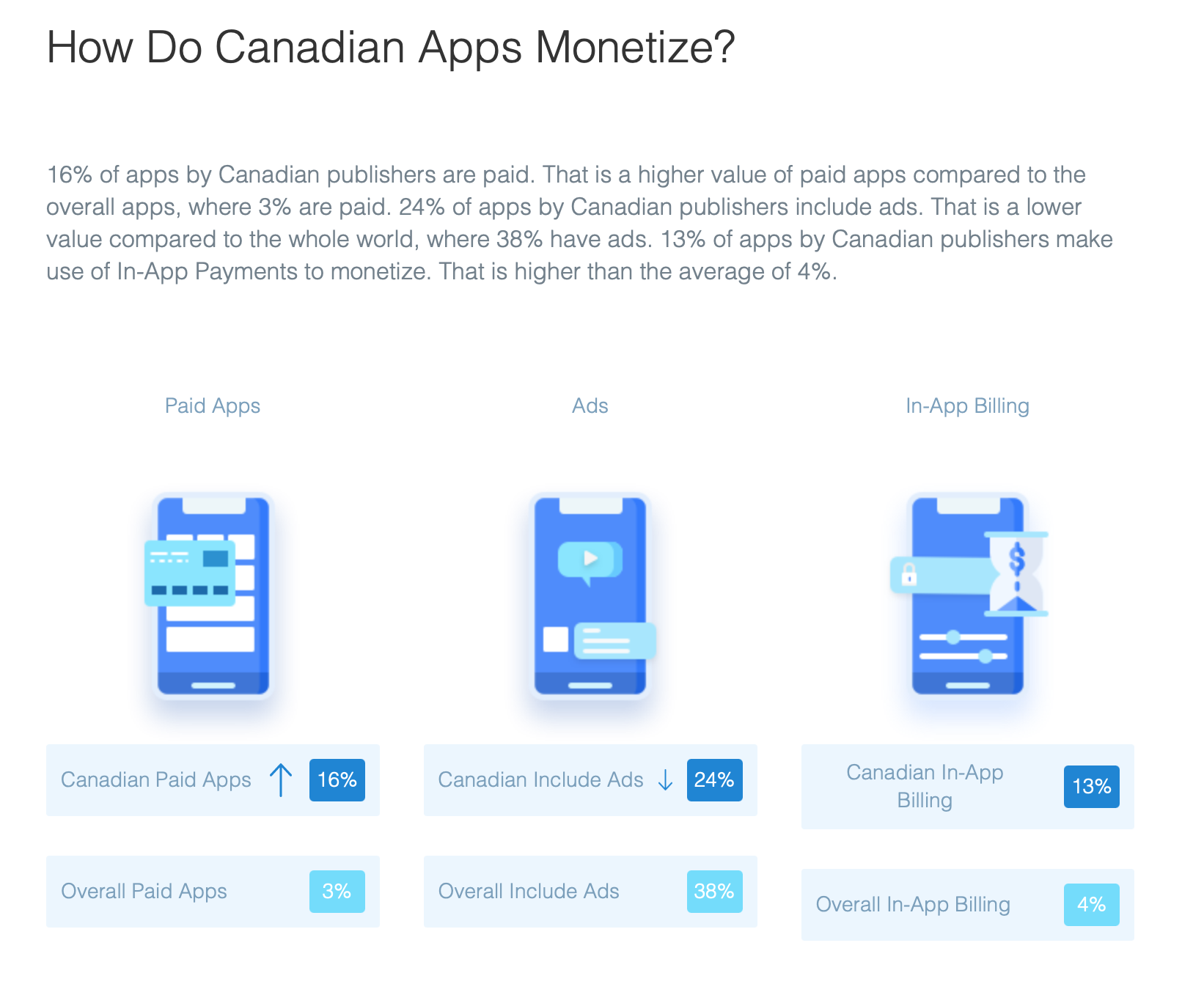
16% of apps by Canadian publishers are paid. That is a higher value of paid apps compared to the overall apps, where 3% are paid. 24% of apps by Canadian publishers include ads.
 Data from 42 Matters
16% of apps by Canadian publishers are paid. That is a higher value of paid apps compared to the overall apps, where 3% are paid. 24% of apps by Canadian publishers include ads.
 Data from 42 Matters
Your app store product page is important because it’s the destination for all of your marketing efforts – ads, search, social media. It’s also the first thing users see when they come across your app within the app market place. But are you really leveraging the power of this page?
Discovery is one of the major challenges for any app developer, regardless of platform. Being able to be found and stand out in the sea of applications is critical to success for an application. This is getting more and more difficult as more and more apps go live each day. App stores were created to aid developers in discovery of their applications but as app inventory continues to grow at a rapid pace, they are unable to assist all of the applications in the same way they did when smartphone and tablet apps first launched back in 2008. Today, it’s more important than ever for developers and app publishers to take matters into their own hands and market their applications to increase visibility to improve downloads for their application.
The goal of app store optimization – improved search discovery
One of the ways that app developers can better the discovery of their app is through optimization of their product page within the app store. This is called ASO or App Store Optimization. The goal of ASO is to enhance the major product page elements to improve search discovery, increase chances of standing out in a list view and better the sale ability of the page to convert to download or purchase. App Store Optimization touches upon all elements of your app’s product page – your name, category, icon, screenshots and even the product description and keywords used to describe and sell your app.
Keys to product page optimization – clarity, credibility, creativity
The key concept behind ASO is to take a look at these elements from a user’s perspective to ensure that they are working hard to market and sell your app. In essence, ASO makes sure that your product page elements are clear and convincing, as well as creative. It strives to remove any ambiguity in what your product offers and attempts to cut through the noise around you to ensure that your app can rise above the rest, whether a user finds your app in search results or views it in a category list.
Pay attention to what your competitors and users are doing
In order to optimize your app store, you need to look to your competitors, as well as your users, and employ the use of some key app tools. In this five-part series, we will be breaking down the steps to perform App Store Optimization to improve the performance of your name, app icon, screenshots and your product description.
The benefits of ASO are great:
Improve search results and immediate app comprehension within app store lists with an optimized name.
Take advantage of app ranking opportunities through our category and sub-category recommendations.
Improve brand recall and rapid app comprehension and increase conversion with icon and screenshots suggestions.
Increase sale ability and improve search discovery with a SEO focused Product Description.
We hope this gets you thinking about your product page as not just a bunch of last-minute elements required to get your app live upon submission, but rather some key and free marketing opportunities at your disposal that can better your chances of app success. Stay tuned for more strategies and tips on App Store Optimization going forward!
@AppPromo we specialize in app strategy, app marketing, app monetization and app store optimization (ASO). We are dedicated to helping you succeed in the business of your mobile application.

🎉 New Year’s Promotion 🎉 Enter the number “21” in the Promo Code field in the form below to get 21% off our App Strategy, Monetization, ASO Services and App Preview Video Services. (Expires 3/31/2021). We are available via Skype, Facetime and Zoom, so please feel free to contact us
@AppPromo for the 3rd year in a row as been named one of the the top 50 Mobile App Marketing Agencies, by Mobile App Daily. Thank you to all our valued clients, because without you, we would not be here. Through good times and bad times we have always put our customers first, and especially during these difficult times, we are here to help app owners make the most of their applications and also making the most money $$$ possible. 🎄 Have a joyous and safe holiday season! 🎄
 The name you select for your app is a critical part of your app development, as it represents the branding for your product. Read on to learn how to select a logical app name, and why sometimes choosing a creative, personal name may actually limit your app discovery.
It goes without saying that the name of your app is extremely critical. It is the first place metadata is collected for all search engines and will become the branding for your product for its existence – unless you are brave enough to risk a rebranding, which could result in a loss of users. The app name also factors into the decision making process a potential downloader uses to decide whether to get your app.
App naming – make it logical, not personal
Naming your app is one of the most exciting steps of application development. Often publishers have an idea of what they want to call their app even before it is developed. The initial reaction with a name is to get creative and make it personal, but this is the exact opposite of what you should do if you wish to optimise discoverability for your app.
When determining the name for your app, you will want to be less emotional and more logical. You will also want to err on the simpler and straightforward side of things. Your name should reflect the functionality of your app in some way.
The best place to start when considering a name for your app is to make a list of search terms your potential users will use to find an app that has functionality like yours. You can create this list of keywords by doing some research yourself and leaning on some digital tools for some help.
Research resources to consider
When you’re starting your app naming research, consider reaching out to these sources:
App store search – Go to the app store and search for apps that are similar to you. What words do you find yourself using? What terms are bringing up results?
Google search (or other online search engines) – Similar to the app store search, use online search engines to help you determine what search terms you are using and what search terms produce results for brands and sites and apps that are similar to yours.
Other people – Ask people what terms they would use to search for your app. Also ask them to describe your app and even go as far as ask them to give it a name. Be sure not to just ask friends and family but other people in your network.
Competition – Look to the competitors in your category to see what terms they are using and use them as inspiration for your potential name list. Look at both their names and their product descriptions.
Online tools to consider
Many tools are available that can help with your app name planning:
Google Keyword Tool – Using the Google Keyword Tool, you can either enter the URL of a company or brand that is similar to yours to be presented with possible keywords or enter a starting term to get some suggestions in return.
AppStoreRankings – AppStoreRankings is a great resource to use for creating metadata for your app. This premium online tool let’s you spy on your competitors and also helps you understand which keywords will perform best in the app store environment by associating a traffic score to each.
AppNique – Like AppStoreRankings, AppNique offers premium services to help provide suggestions for search terms for your app.
Incorporate keywords into your app name or sub title
Starting with a list of keywords will help ensure that your app is rooted in search – a key discovery method for users. It will also help make sure that your app name is incorporating terminology which people attribute to your app’s main functions. In addition, you will be able to leverage this list for your product description which we will tackle in a later article in this series.
Once you have this list of keywords, you can use them to create a name. In some cases, using some of the actual keywords in the name will make better sense. For example, if your app is a calculator app then you will most likely want to include the words calculator or numbers or math in the app name. For other app categories, like in the case of games, you may wish to use these keywords as more of a sub-title. For example Move and Shake – a Puzzle Game for Kids.
Using a sub-title in your name is a great strategy to include more metadata for your app but will also help to clarify an app that is given a more creative name for branding purposes.
Hopefully this has given you a clearer understanding of why choosing the right name is a critical component of app development. With the help of this ASO exercise, you will improve your chance of selecting a name that works for you, rather than having a name that works against you.
***
About App Promo
App Promo is a leading app marketing and strategy firm whose goal is to assist developers and app owners in succeeding in the business of applications. App Promo provides services geared towards increasing discovery, optimising revenue and ensuring better positioning of applications to set them up for success.
 Your product description is arguably the most difficult of all of the product page assets to put together. It’s no wonder than that most app publishers only bother to write one or two sentences in this field when they usually have up to 4,000 characters. Writing about your product can be a challenge, especially when you’re faced with a blank page and you’re more inclined to write code than marketing copy. Luckily, we’ve created a formula which can help you create an effective product description which is aimed to sell your app and gain the download.
Start with your search terms
Before we break down the formula, the first thing you’ll want to do is refer back to the list of search terms that you created when considering a name for your app (App Store Optimisation # 2 – What’s in a name? Everything!) Your product description is a great place to use any or all of these search terms, as long as they make sense within the copy. This will help ensure that your product description not only provides an effective explanation to potential downloaders on why they should download your app, but your product description will also be working to attract traffic to this page through these search terms.
Use all available characters
It is important to maximise all available characters in the product description. Additionally, you should make use of features such as embedding video. Investing in a YouTube video to demo your app, or getting a video review site to review your app and using this in your description, are some great ways to use the free tools that app stores are providing you.
Five elements for a great product description
So what makes up a great product description? It all comes down to five key elements:
The elevator pitch.
The pricing statement.
Reviews or user feedback; or the News section.
Features and functions.
The sales pitch.
The elevator pitch is a short, succinct description of your app that answers these questions:
What is your app?
What does it do?
Why should I care?
Why are you different?
We call this the elevator pitch because you should be able to articulate this in a few sentences, two or three sentences at the most. Readers should be able to get a clear picture of what your app is all about and most importantly, why they should download it from this statement. If this was the only thing they were able to read about your app, it should compel them to download it. This is why your product description will start with this statement.
The pricing statement articulates the costs associated with the app. If it is free then state this – even if it is also obvious from the pricing label in the app store. This area becomes increasingly important when your app is using a freemium model. In this way, you’ll be setting expectation for the user that your app is free to download but that there are premium areas offered inside they need to be aware of. By clarifying the pricing upfront, you’ll reduce the number of downloads which will result in customer complaints.
The review or news area is a great spot in the product description to pull out a comment or rating from users, app store review sites, or even chart success from the app store. This area helps balance out the marketing copy you are creating as the app owner, with feedback from credible and more social resources that potential downloaders will listen to as part of that community.
The features and functions section is an obvious addition to the product description. In this area, we suggest that you list out the main features of your app. Using an actual ordered list will make it easy to read in the product description. Here, you’ll want to focus on the core elements of your app and highlight those that make your app differentiated in the market. As you grow your product roadmap, you’ll want to keep this list updated in your description.
Finally, the sales pitch is the last statement in your description. This statement should echo again the reason why users should download your app. It‘s also an area to market your website, social networks, videos, and any other apps that you want to include as part of your brand or product offering.
One last tip to remember once you have your product description up and live in the app store is that your product description should not remain static. You should revisit your product description with every product update to make sure that your copy reflects new features. In addition, any news or new ratings, reviews or successes should be celebrated here.
Good luck!
Apple Inc. said on Wednesday it plans to start a program to lower its App Store commissions for software developers who make $1 million or less in proceeds each year from the store, but some of the company’s critics called the move “window dressing.”
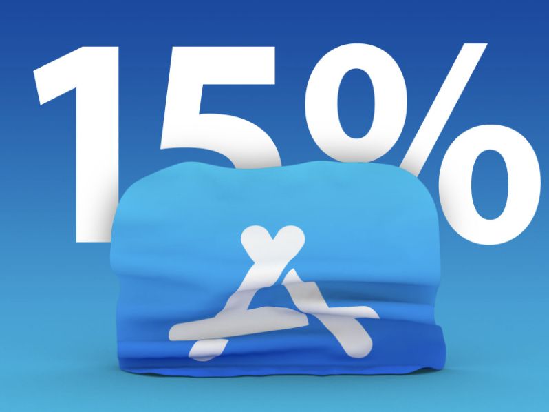
Apple takes a 30% cut of most purchases made on the App Store, although the commission drops to 15% for subscriptions that remain active for more than a year.
The iPhone maker said developers will automatically get the lower 15% rate if they generate $1 million or less in proceeds – defined as the portion of store purchases that the developer keeps – in a calendar year.
Apple’s App Store fees and rules have come under fire from large firms such as Microsoft Corp, Spotify Technology SA, Match Group Inc and Epic Games as well as startups and smaller companies that allege the fees deprive consumers of choices and push up the price of apps.
“This would be something to celebrate were it not a calculated move by Apple to divide app creators and preserve their monopoly on stores and payments, again breaking the promise of treating all developers equally,” Epic Games Chief Executive Officer Tim Sweeney said.
In reply to its critics, the iPhone maker has previously said its rules apply evenly to developers and that the App Store provides an easy way to reach its huge base of users without having to set up payment systems in the 175 countries where it operates.
The move will affect a broad swath of developers, but it was unclear how big the financial impact would be for Apple.
Based on the publishers it tracks, analytics firm Sensor Tower said 97.5% of iOS developers generated less than $1 million per year in gross consumer spending. But those same developers contributed only 4.9% of the App Store’s 2019 revenue.
|
|
 Your product description is arguably the most difficult of all of the product page assets to put together. It’s no wonder than that most app publishers only bother to write one or two sentences in this field when they usually have up to 4,000 characters. Writing about your product can be a challenge, especially when you’re faced with a blank page and you’re more inclined to write code than marketing copy. Luckily, we’ve created a formula which can help you create an effective product description which is aimed to sell your app and gain the download.
Start with your search terms
Before we break down the formula, the first thing you’ll want to do is refer back to the list of search terms that you created when considering a name for your app (App Store Optimisation # 2 – What’s in a name? Everything!) Your product description is a great place to use any or all of these search terms, as long as they make sense within the copy. This will help ensure that your product description not only provides an effective explanation to potential downloaders on why they should download your app, but your product description will also be working to attract traffic to this page through these search terms.
Use all available characters
It is important to maximise all available characters in the product description. Additionally, you should make use of features such as embedding video. Investing in a YouTube video to demo your app, or getting a video review site to review your app and using this in your description, are some great ways to use the free tools that app stores are providing you.
Five elements for a great product description
So what makes up a great product description? It all comes down to five key elements:
The elevator pitch.
The pricing statement.
Reviews or user feedback; or the News section.
Features and functions.
The sales pitch.
The elevator pitch is a short, succinct description of your app that answers these questions:
What is your app?
What does it do?
Why should I care?
Why are you different?
We call this the elevator pitch because you should be able to articulate this in a few sentences, two or three sentences at the most. Readers should be able to get a clear picture of what your app is all about and most importantly, why they should download it from this statement. If this was the only thing they were able to read about your app, it should compel them to download it. This is why your product description will start with this statement.
The pricing statement articulates the costs associated with the app. If it is free then state this – even if it is also obvious from the pricing label in the app store. This area becomes increasingly important when your app is using a freemium model. In this way, you’ll be setting expectation for the user that your app is free to download but that there are premium areas offered inside they need to be aware of. By clarifying the pricing upfront, you’ll reduce the number of downloads which will result in customer complaints.
The review or news area is a great spot in the product description to pull out a comment or rating from users, app store review sites, or even chart success from the app store. This area helps balance out the marketing copy you are creating as the app owner, with feedback from credible and more social resources that potential downloaders will listen to as part of that community.
The features and functions section is an obvious addition to the product description. In this area, we suggest that you list out the main features of your app. Using an actual ordered list will make it easy to read in the product description. Here, you’ll want to focus on the core elements of your app and highlight those that make your app differentiated in the market. As you grow your product roadmap, you’ll want to keep this list updated in your description.
Finally, the sales pitch is the last statement in your description. This statement should echo again the reason why users should download your app. It‘s also an area to market your website, social networks, videos, and any other apps that you want to include as part of your brand or product offering.
One last tip to remember once you have your product description up and live in the app store is that your product description should not remain static. You should revisit your product description with every product update to make sure that your copy reflects new features. In addition, any news or new ratings, reviews or successes should be celebrated here.
Good luck!
Starting today, we’re introducing App Promo’s developer 101 tutorial series, where we’ve asked our friends at App Promo, a leading app marketing and strategy firm, to share some of their best hints and tips for developers. We’ll be sharing their tutorials as a summer series of blog posts that will be published weekly for the next 10 weeks.
App Promo’s first tip focuses on the importance of understanding your product. In order to create a truly successful product, you must take a step back and look at your app from outside-in. What is the purpose of the app and why would a user in your target group use it? Have you defined a target group? If you spread too thin when defining your target group, you might not get any pickup in any demographic groups. If you instead target a well-defined group, you’re improving your chances a lot of getting successful with this group. From there, you can widen your scope. This concept and much more is explained in this article. Learn more…
When you take into consideration that over a million applications are available in app stores today, what’s the best way to navigate the marketplace in order to ensure your app has the best visibility possible? This is where App Promo comes in. As leaders in app marketing and strategy, App Promo’s goal is to assist developers and app owners in succeeding in the business of applications. We recently collaborated with them to bring you a series of tutorials – tips and tricks to guide you and help take your app to the next level. Our first developer success tip is to concentrate on your product.
No matter what marketing efforts you put behind your app, the success of any campaign will come down to your product. Being a product owner, it is extremely important for you to understand your app’s purpose and demographic and translate these ideas into a working product that has the utmost quality for your user.
Define your app’s purpose
Regardless if you are building a game, utility or a communication tool, the key to app success is to understand what you are building and why it will benefit your user. Your app’s purpose should be extremely focused. Don’t try to accomplish too many things at once or you risk confusing, overwhelming and losing your user. Look to your competition to help you define things. What are they doing well, what are they missing at and what can you do better?
A great exercise to help you fine tune your objective is to explain your app in six words or 140 characters (like a tweet) or less. This is not only a great way to clarify your concept but the output can also be used to create your marketing messaging in your upcoming campaigns or your unique selling proposition (USP).
Put yourself in the user’s shoes
Once you have determined WHAT you are building take yourself through the remaining 4 Ws to help understand your demographic.
Ask yourself:
Who are you building this app for?
Why will they use it?
When will they use it?
Where will they use it?
It is extremely important to know who your user or users are and to continue to think like them throughout the idea, design, development and especially testing phases of your app project.
Keep this demographic in mind when it comes to your marketing. Target your paid media to this audience. Cater and create your marketing messaging using the answers to the questions above. Maintain a consistent vision of who your user is to be sure that you end up with a product that your users want.
Don’t cheap out on quality
Marketing is there to bring visibility and traffic to your application. But it can backfire if your application is not ready for the spotlight. Be sure that when you kick-off your marketing efforts your product is available and working. Your project timeline should have a strong emphasis on testing – both from a code and user perspective, to flush out bugs that will cause the app to crash and give a poor user experience.
It is often wise to schedule a marketing launch a time after the actual production launch of your app (or general release). This will give you time to see traffic and usage of your application from real users in a manageable volume. The feedback you gain during this time will help determine how ready you are to continue promoting your app.
Use your product roadmap as a marketing tool
The app ecosystem is an active one. Users expect to see updates to their apps and look forward to fixes, design changes and new features when it comes to their favourite applications. These updates act as a form of marketing to your current users as the notification they will receive will keep your product top of mind and will spike usage. Be sure to spread out your updates to allow for usage to drop before you release another version to maximise its impact.
Keep on top of new operating system software updates and update your product with features that utilise them if it makes sense. Updates to your app are also a great reason to establish a marketing campaign outside of launch so start to view them as more than just code releases. Also remember to incorporate your users’ feedback and comments, as this can improve your app or service.