App Previews – The importance of app video previews in the new App Store for iOS8

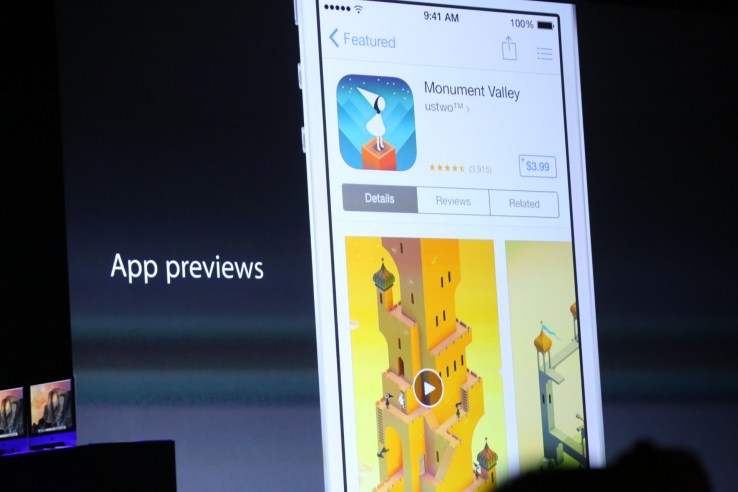
Engage customers with a short video of your app in action, directly on your app product page on the App Store. By showing the experience of using your app, app previews can help customers better understand your app and encourage more downloads.

Overview

An app preview demonstrates the features, functionality, and user interface of your app in a short video that users can watch right on the App Store. Each preview is between 15 and 30 seconds long and is displayed as the first image on your App Store product page, followed by your app screenshots.

Getting Started

With iOS 8 and OS X Yosemite, you can capture real-time footage of your app directly from your iOS device. Simply connect your device to your Mac using the Lightning connector and it will be automatically available as a video camera. You can capture anything you’re doing on-screen directly to your Mac using QuickTime Player. Edit your captured footage in iMovie or your favorite video editing app and upload it to iTunes Connect for review along with your next app update.

Submitting App Previews

If you submit app previews they will appear in all countries where your app is available. However, you may only submit a single set of app previews designed for iPhone, iPod touch, and iPad in one language localization.

Just like screenshots, each app preview is device-specific and requires an iPhone, iPad, or iPod touch with a 4-inch Retina display to view or submit. For detailed technical specs and step-by-step instructions on how to submit app previews, read the iTunes Connect Developer Guide.

Creating a Great App Preview

App previews are between 15 and 30 seconds long and it’s important to make the most of this time to help customers better understand your app’s content and features. These tips will help you create a great app preview that sparks interest and drives downloads of your app.

Planning Your App Preview

App previews use footage captured on device to show the experience of using your app. Users want to see an honest depiction of what to expect from your app, so resist the urge to overproduce your video. Consider these steps as you structure the content and flow of your preview.

  1. Develop an outline or storyboard highlighting the magic moments that make your app unique. A great place to start is your app product page—focus on the top 3–5 features you’ve identified in your app description and use these as your framework.
  2. Map out a list of scenes you’ll need, then plan the timing so you know how many seconds to devote to each feature.
  3. Aim to tell a cohesive story so that users get a sense of the journey they will experience when using your app. Craft messaging to explain transitions or features within the UI.
  4. Consider any demo content you may need to create to show your app. Create dummy accounts any time you need to display personal information.

Content and Format

App previews are for all audiences, so your preview must be 4+ appropriate. Avoid objectionable content, violence, adult themes, and profanity.

App previews are between 15 and 30 seconds in length. Make the most of this time to show what makes your app special.

Capture app footage from the device using QuickTime Player on OS X Yosemite. Don’t film people interacting with the device (such as over-the-shoulder angles or fingers tapping the screen). Stay within the app.

Show only material you have the legal right to display. If your app displays protected content such as music, film, trademarked characters, brands, or other intellectual property assets, ensure you have the appropriate licensing rights for your marketing use in all territories. If your app accesses the iTune Library, use only song that you’ve created or that you’ve specifically licensed for use in the preview.

Graphics and Transitions

Add graphic elements, such as touch hotspots, only when necessary to demonstrate how navigation or interaction work within the app. Don’t overlay animated hands simulating Multi-Touch gestures.

We recommend capturing the native resolution of the UI; avoid zooming in on the view. Ensure the transitions between scenes don’t imply functionality that your app doesn’t have. Use straightforward transitions like dissolves and fades.

For games, show a higher ratio of gameplay to cutscenes. Cutscenes may mislead your audience by giving a false impression of gameplay. Get your audience excited about the elements they will actively engage with once they download the app.

App Previews on App Store Product Pages

App previews are displayed as the first image on your app’s product page, followed by your app screenshots. This is one of the first elements a user will see on your product page, so ensure the preview poster frame is visually compelling.

Ideally, your preview poster frame should convey the essence of the app. If the default frame selected from your footage doesn’t convey this, you can select a new frame in iTunes Connect. Please note that changing the poster frame on previews that have already been approved will require a new binary version.

Using Copy

App previews are not localized, so we recommend limiting the use of copy to maximize engagement globally.

When copy is necessary to give context to the footage, use easily understandable terms and consider language choice in light of your target audience.

Ensure text is legible and remains on screen long enough for your audience to read it.

To keep your app preview timeless, we recommend avoiding references to specific events, seasons, or memes that will date it (such as “New for spring!”).

We recommend leaving out references to pricing in your app preview. Pricing is already shown on the App Store product page, and references within the preview won’t be accurate in all countries and territories.

If you display features that are only available through In-App Purchase you must disclose this, but it’s a good idea to show it even when the In-App Purchase is optional so that users know what to expect. Disclaimer copy can be included contextually within the footage or in the end frame.

If your app uses a subscription model or requires login, we recommend identifying this in your preview.

Overlaying Audio

Consider overlaying the musical score of your app as the soundtrack to your app preview. Overlaying ensures that the audio isn’t disjointed when one scene cuts to the next.

We recommend capturing the sound effects of your UI in your footage to reinforce the functionality of your app. Work with high-quality audio equipment in locations without background noise when recording voiceovers so that all audio in your app preview delivers the best possible user experience.

Consider that your app preview is available in one language worldwide. Narration may not be appropriate in apps marketed globally. If you decide to use narration in your app preview, we recommend working with a professional voiceover actor. This is the voice of your app—make sure it resonates.

App Store Review

In addition to your app, we review all app previews to ensure they comply with our App Store Review Guidelines. Please observe these guidelines before submitting your App Preview with your app.

Create App Previews with iMovie and Final Cut Pro X

iMovie comes with every Mac and makes it easy to create app previews. Edit screen recording videos to get the timing just right, then customize your preview with titles, transitions, a soundtrack, and voiceover. To learn more, read the iMovie Guide for Creating App Previews.

Final Cut Pro X offers even more power for creating app previews, including advanced tools for audio and video editing. Download a complete set of titles designed to showcase your apps, or create your own custom motion graphics. To learn more, read the Final Cut Pro X Guide for Creating App Previews.

What I learned from soft-launching in Canada

Basketwars

By  on October 10, 2014

I knew it was a gamble right from the start. Forfeiting your relatively safe, more traditional corporate career for the sake of a dream, in this case, building an independent gaming software company.  Every day I kept reading about the financial success stories behind Candy Crushand Clash of Clans, and it kept whetting my appetite to get into the industry itself.

Knowing the uphill challenge I faced in this precarious industry, I still made the decision to develop a mobile game while pursuing my executive MBA from Pepperdine University. I was able to raise $30,000 from friends and family (including exhausting my savings) to start JABB Interactive, LLC. My goal was to build my first freemium mobile app, BasketWars.

In such a competitive space as mobile gaming, you obviously must differentiate yourself. I wanted to combine different aspects of gameplay with different genres and mash it up into one game. I enjoyed Basketball, having played it competitively at college.  Most game players enjoy blowing things up. Why not turn basketballs into actual characters and integrate them into a warfare scenario? To my knowledge, there were few if any mobile games that offered the marriage of such two compelling topics in mobile gameplay.

I reached out to a Los Angeles-based app development company who were excited by my concept and agreed to help me build it. I selected World War II as the game’s backdrop because it lent itself to terrific design opportunities and fun characters.

It didn’t take long for me to hit my first major bump in the road. I underestimated the amount of time it would require to finish the game. It took two years to complete BasketWars. Now I had to wrestle over how BasketWars should be made available. Freemium? Paid?

Having no experience with previous game app monetization, I rationalized that making the game free was just too risky a business proposition. I also came across a number of free game case studies that illustrated huge acquisition of users but generated no profit because users did not find value in purchasing in–app content. I settled on a free, “lite-version” of the game, in addition to offering a paid version for $1.99.

I needed still more funds to bring BasketWars to market. Turning to Kickstarter, I was able to raise an additional $10K. While I began allocating more funds for promotion and marketing, the best advice I ever received was from speaking to Gary Yentin, CEO & Founder of App-promo.

After reviewing BasketWars and my plans for U.S. launch, Gary bluntly told me I did not have sufficient budget to acquire new customers in the U.S. that would enable me to get sufficient downloads and drive chart popularity. Instead, he recommended launching into the Canadian marketplace first and for the following reasons:

  • Getting to the top of subcategories in Canada is much easier and cheaper to accomplish when compared to other countries, including the U.S.
  • We could affordably test how popular the game was, and if the monetization techniques we implemented were effective or not
  • If we got negative reviews in Canada, we could fix those issues before seeing any negative comments appear in stores like iTunes or Google Play
  • We could continue to fix bugs and refine gameplay

Gary’s company was also based in Canada and had relationships with many of the top game reviewers.

Canadian soft launch proves invaluable

We launched in Canada in May of 2014. My team partnered with a mobile app analytics company called Appsee. Appsee allowed us to watch recorded video gameplay using heat sense technology. What did we learn?

BasketWars was not ready for prime time

  • We got immediate feedback on where users got frustrated or annoyed
  • Inefficiencies – improvements were needed in design, core gameplay, login, and in particular, tutorials
  • How long it took for users to convert to paying customers
  • Previous unidentified bugs/crashes
  • How effective our ad placements were

Canadian App Store Results

  • Our free/lite version: 3,220 downloads
  • Paid version ($1.99): 2 downloads
  • In-app purchases: 1
  • Total Revenue: $3.39
  • We reached #8 on the Sports subcategory under games.
  • We reached level 51 in the Action subcategory.
  • 157th in Games category
  • 517th in Overall apps

It was a sobering experience.  While the numbers were less than stellar, we also received constructive feedback from our Canadian pool of users. In particular, we learned:

  • Our tutorials were overly long and players got antsy, deciding to leave the game. (We didn’t include a skip button)
  • Many of our Canadian users did not speak English. Most were French Canadian and they not only misunderstood the tutorial itself but couldn’t figure out how to score a shot.
  • The game’s flow was not uniform. Players did not understand when to push certain buttons. Players grew frustrated.

The user feedback proved invaluable.  We were forced to go back to the drawing board and implement a complete UI overhaul, including a core change in gameplay.

Gameplay redesign

We originally designed BasketWars for players to make one shot per level, which would get progressively harder with each new level attained. Players got frustrated right off the bat because of their inability to make a shot on the first level. We learned that gamers must be pumped up with enthusiasm right from the start and that meant making it much easier to score on the first few levels before making gameplay more challenging.  We accomplished this by changing the shooting mechanism from an “Angry Birds” style pullback, to a point, drag, and release.

We also changed gameplay from making one shot to pass a level to making as many shots as players can in a limited time frame. In our testing groups, these two changes alone brought with it a tremendous improvement in the level of player satisfaction. Gamers who previously experienced the older version of gameplay remarked that they now felt much better about the gameplay and wanted to continue playing.

In reviewing the Appsee videos, we saw those players who couldn’t read English get extremely frustrated. Simple tasks could not be completed that were explained in English. We realized that any tutorial provided at the start of the game needed to transcend any language barrier. We accomplished this through animation and pointers.

Our monetization strategy 

In our Canadian soft launch, we made both a free and paid version of BasketWars. The paid version received only one download. In our free version, of the more than 3,000 beta testers, we documented only one in-app purchase. In studying monetization strategies from some of the more successful games, we knew that the most important factor in driving in-app or paid downloads was the “fun factor” and that users “got it” as soon as they started playing the game. We made the strategic decision to stick with a freemium model only and in our minds, believe it will give us the best chance to succeed in an increasing fickle gaming market.

Preparation for U.S. and global launch  

Braving the treacherous waters of mobile gaming app development proved a steep learning curve. I myself never waivered in my belief that BasketWars is as fun a game today as the day it was conceived. The JABB Interactive team learned a tremendous amount from BasketWars Canadian debut.

Since soft launching in Canada, we’ve continued to test BasketWars with small groups of beta testers here in the U.S., including friends and family. We are launching in the U.S with no marketing dollars and no paid promotion.

Our strategy includes using current lists of interested users while organically promoting BasketWarsvia social media channels to drive sufficient downloads to evaluate how well users are participating and enjoying the game. In effect, we are treating our U.S. launch as a second soft launch to further test the new UI/gameplay based on what we learned in our Canada soft launch.

Because we are an indie game development company, we are unable to spend vast sums of money on customer acquisition. Our strategy is to drive downloads through social media outreach, gaming blogger outreach, strategic partnerships and small promotional campaigns.

We feel BasketWars currently boasts a superlative design and incorporates two years’ worth of learning the ins and outs of studying what constitutes a fun and enjoyable mobile game. Earning my MBA has proven its value, helping me develop JABB Interactive’s marketing and overall business strategies and preparing me for the launch of BasketWars in October. We feel confident that BasketWars will receive a warm reception by game fans in the U.S.

@Mobilepersonas Holiday Shopping and New Mobile Tech Insights

For those who missed the live webinar for @MobilePersonas, please find enclosed the slides that were covered in the presentation. It’s not to late to include any custom questions for the final report, so please contact if interested. Enjoy!

MobilePersonas 2014


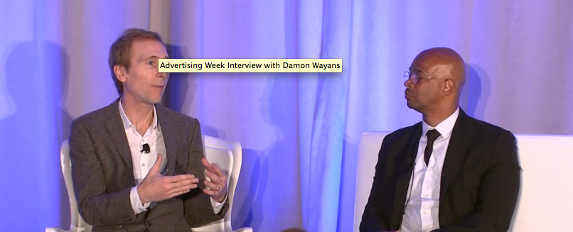
Advertising Week 2014- Huffington Post interview with Gary Yentin CEO of App-Promo

App-Promo CEO Gary Yentin was interviewed by the Huffington Post @Advertisingweek 2014 on the topic of the business of mobile applications. The interview covers the mission statement of App-Promo, helping developers in the business of the mobile applications and six (6) years later @Apppromo is still going strong!
Advertising Week 2014

App-Promo Fall 2014 Newsletter

App Promo

Ms. Pac-Man Breast Cancer Mobile/Social Media Awareness Campaign

@Appromo is proud to be working with Bandai Namco and The National Breast Cancer Foundation. The mission of NBCF is to help women now by providing help and inspiring hope to those affected by breast cancer through early detection. During the month of October, Ms. PAC-MAN & PAC-MAN mobile games will feature the Ms. PAC-MAN Pink Ribbon campaign to support the National Breast Cancer Foundation.


Mobile Personas 2014  US and CA

The 2014 Study combines a comprehensive analysis of mobile behavior, attitudes and trends over time to help agencies, brand marketers and manufacturers devise effective mobile strategies. Mobile Personas is a collaboration between Brandspark International (consumer and shopper insights), Tapped Mobile (mobile advertising) and AppPromo (app strategy and monetization). The study is available for US and Canada.

@Apppromo selected for 2nd yr to speak and exhibit @Advertising Week 2014 NYC

For the 2yr year in a row @Apppromo has been selected to speak and exhibit @AdvertisingWeek 2014 in NYC. If you are in the city please visit us on Mobile Monday Sept 29th in the TimeCentre Hall at Exhibit Booth C1. 
 

On a special note, Gary Yentin, CEO of App-Promo will be interviewing Damon Wayans at the Cross Screen Sumit on Mon Sept 29th at 4:30pm on the topic of how today’s consumer engages with content.                                                                                              Read More>>

Cannes Lions Festival 2012

Featured App
Socialmaps

NB

Socialmaps is a new and innovative location based app that automatically lets you know when friends are nearby, or post nearby. By using permission based real time location for our users, and information from all your social networks (Facebook, Twitter, Instagram, etc), SocialMaps can keep you up to date about what’s going on locally and what is of interest to you.
Click here to download 

Featured Client
Sobrr – life in the moment

On Sobrr, everything expires in 24 hours. We all have moments that we wish were never recorded. With Sobrr social networking app, you can meet people, make friends, and share your life freely.W hen you send SobrrChat messages to non-iPhone users, they will be received via SMS, where they will be linked to a browser. (And, yes, these will also expire in 24 hours.)
App-Promo App

@AppPromo  Fall Promotion

Interested in our App Monetization or our App Store Optimization (ASO) Packages? Enter the code “Fall 2014“ in the Promo Code field in the form below to get 14% off our Monetization or our ASO  services. (Expires 12/21/2014)
Click for more information
Copyright © 2014 App Promo All rights reserved.
For more information about App Promo or to read our Terms and Conditions and Privacy Policy visit us at www.app-promo.comOur mailing address is:
19 Tarlton Road, Toronto, ON, M5P2M6, Canada
Facebook
Twitter
LinkedIn

App-Promo Summer Newsletter 2014

Welcome the App-Promo’s Summer Newsletter 2014. In this issue we cover the business of app development with a great marketing podcast from Gary Yentin CEO of App-Promo. We also cover the launch of Legend of HeroesXIII an epic card game for iOS and Android as well as preview our upcoming video series for Amazon. Enjoy Summer 2014! and don’t forget to check out our  special Summer ASO promotion!
App Promo
Android 3 Platforms

PODCAST:
THE BUSINESS OF APP DEVELOPMENT

Less than one percent of apps have more than 50,000 users according to a report from Quantcast. Like most businesses, starting from the fundamental components like strategy and monetization are crucial to app discovery.

Gary Yentin, CEO and Founder of App Promo, discusses solutions for startups looking to leverage their current marketing strategies and drive user acquisition.

App Store Optimization

Legend of Heroes XIII
Epic card game launches @E3

App-Promo was extremely pleased to launch our client Ever App and the mobile game- Legend of Heroes XIII @E3 Expo in Los Angeles. The response has been amazing with the game advancing to No.1  in Hong Kong and in the top 10 card games in the US (iOS and Android). Much more to come including a tournament in Hong Kong at the end July where players will be flow in from around the world to battle each other and compete for prizes including a Mini Cooper!  Don’t forget to download Heroes XIII game FREE to play iOShttp://bit.ly/1kbtA1Q Android (http://bit.ly/1mVqFZO ) 
 

Amazon Developer -Video Series

App-Promo is very proud to be selected by the Amazon Developer Program to create a video series on the business of mobile applications. Our initial video will be live on June 26th on the topic of App Discovery with additional topics to be covered including ASO, Blogger Outreach, Social Media Marketing and App Retention and Monetization- Stay tuned and visit our website for more information.

Cannes Lions Festival 2012

Featured App
Basketball Wars

NB

If you are in #Canada and looking for a game of #basketball but can’t find a court. Look no further than our new client’s app and than your #iPhone. App-Promo is proud to work with Jabb Interactive on the launch of their first mobile game which has already topped the charts in Canada and soon to be launched in the United States. 
Click here to download 
TopApps_icon_ott_1024

Featured Client
Top Apps

Tired of searching for the really great Android Apps? Discover the best Android apps and games with TopApps, your free guide through the crowded jungle of the Android App Market! TopApps scans Google Play daily and regularly updates recommendations-focusing only on the 20 best apps per category.  App-Promo was actively involved in the strategy and now the launch of the application. Download it today –
App-Promo App

ASO Summer Promotion

Interested in our App Store Optimization (ASO) Packages? Enter the code “Summer 2014“ in the Promo Code field in the form below to get 14% off our Monetization or our ASO  services. (Expires 9/21/2014)
Click for more information
Copyright © 2014 App Promo All rights reserved.
For more information about App Promo or to read our Terms and Conditions and Privacy Policy visit us at www.app-promo.comOur mailing address is:
19 Tarlton Road, Toronto, ON, M5P2M6, Canada
Facebook
Twitter
LinkedIn

Apple’s iOS App Store Gets Massive Overhaul With Trending Searches, Video Previews, App Bundles And More

Apple announced a significant overhaul to the iTunes App Store on iOS this morning at WWDC in response to the challenges developers have faced as the store became increasingly crowded over the years. Today, there are 1.2 million iOS applications, meaning that the traditional means of finding “what’s hot” like the App Store’s Top Charts or Editor’s Picks, for example, are no longer enough. To address this problem, Apple is giving App Store search a serious makeover, with new features like “trending applications,” continuous scrolling, App Bundles, video previews and more.

“I do read your emails,” said Apple CEO Tim Cook with a chuckle, when detailing the App Store update.

In the iOS 8 App Store, which comes as a part of the forthcoming new version of Apple’s mobile operating system, users will have a new “Explore” tab that lets them delve deeper into the App Store’s offerings, including by category and subcategory.

Also new is a continuous scroll, which is more of a performance improvement related to moving through the App Store search results, which was not always the fastest way to navigate through a set of applications.

App Bundles, Video Previews, And More

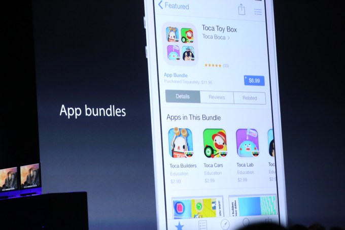
Developers will also be able to create “App Bundles,” which help them better market and sell groupings of their applications to App Store shoppers. This would be helpful to those developers who specialize in certain types of applications, like a suite of apps for photo editing, for example.

Consumers will now have the option to buy these apps in bundles, which could potentially increase developers’ App Store sales.

A prominent children’s app developer, Toca Boca, was shown as an example of the App Store bundle with a grouping of apps called “Toca Toy Box,” which allows users to download a whole set of apps from the developer at a discount, when compared with buying the applications one-by-one.

IMG_0200

Meanwhile, a feature for video previews of apps – something that, we should point out, arrived on Android first – allows consumers to view the app in action before they make the decision to purchase. These short App Store videos are perfect for tweeting or sharing on Vine, and help to give a better idea about how an app looks and feels versus a screenshot, which can be misleading.

When played, the videos fill the screen, giving users an experience that’s as close as possible to what it’s like to use the actual application, without having to download it.

For developers who take the time to craft high-quality apps with elegant transitions and animations, videos will also help them better showcase those efforts. And for gamers, video previews will let them get a taste the gameplay before committing to a download.

Another feature involving related search suggestions that prompt you with other possible searches to try, also got a brief mention during the keynote, but this had already launched earlier this year.

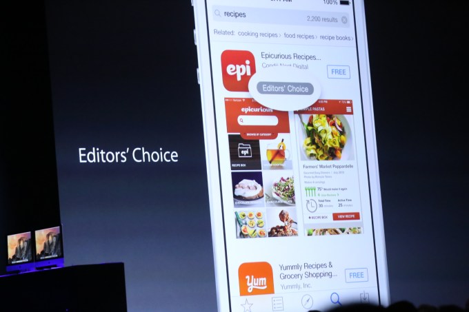
And top apps that Apple likes will now get an Editor’s Choice logo to help with app recommendations.

IMG_0199

Family Sharing

A handy feature for multi-iOS device families is the new “family sharing” option, which will allow users to buy apps one time then share with others. This feature extends to other media as well, including photos, videos, calendars and reminders. Users will need to have the same payment card details on file for this to work, however, so no – you can’t “family share” with a just a bunch of friends.

The Family Share feature also lets parents approve children’s app purchases, which is a great addition that saves the grown-ups from constantly having to type in their App Store password. The feature will alert the parent via an approval notification, which is handy.

Trending Searches

The “Trending Searches” section in the App Store is very interesting, and possibly one of the more important features of the new release, as it gives developers another way to get their apps found.

You can think of this section as something like Twitter’s trends, as it will give a look at what’s currently hot on the App Store, without the reliance on App Store chart rankings, which have been repeatedly gamed by unsavory developers who know how to hack the algorithm. Apple didn’t clarify how ‘trending searches’ works, or how real-time it is, but it does appear that this, along with the other “Explore” features will replace the “Apps Near Me” section which debuted in iOS 7, and nearly really gained mainstream adoption as a way to find new apps, due to its limited use cases.

IMG_0202

TestFlight

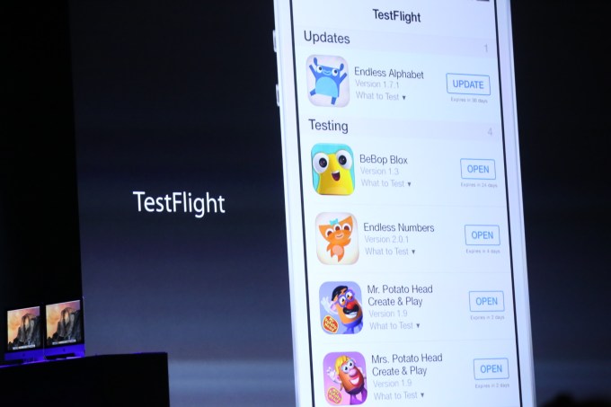
Not entirely unexpected was the announcement that recent Apple acquisition TestFlight, an app beta testing service, would now be integrated into the the developer center, giving developers native (and public!) app beta testing. You can read more about that changehere.

Related to the App Store changes, developers are also getting a new software development kit, with 4,000 new APIs to hook into. As a part of this change, developers can now build their own widgets for the Notification Center, but not the homescreen.

Posted  by  (@sarahintampa)

Apple’s iOS App Store Gets Massive Overhaul With Trending Searches, Video Previews, App Bundles And More

Pages:«1...20212223242526...35»

Events

  • No events yet