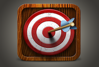
If a picture is worth a thousand words then your app icon is worth more than any other asset for you mobile application.
Your app icon is the most evident element of your branding both on the home screen of the users device and in the app store where they make the decision to download.
Consumers are making app purchase decisions based on icons similar to how they often judge a book by its cover. With mobile shopping behavior usually being extremely impulsive, even guttural, it is extremely important to be able to stand out from the crowd and convey as much about your app as possible in an instant.
How compelling and clear your app icon is for a user will translate not just to acquisition of new users but will also factor into the decision making process for which app to open from the device home screen.
When it comes to your app icon think how can I convey what my app does while making sure the icon says DOWNLOAD ME.
The first step in knowing what to do in designing your app icon is to understand what not to do. The best way to do this is to visit the application store of the platform you are developing your app for and browse. Look through categories you feel your app should sit within to see what your competitors are using. Take a look at the top applications to see what their app icon includes.
It’s best to keep your app iconic. Avoid being overly wordy. In fact avoid words at all. Using objects, symbols or letters is best to achieve a clear and easy to digest icon. Consumers should see your icon and be able to identify the imagery you are illustrating. But beyond recognition, they should get a sense as to what your app is all about or what type of app you are providing from your icon.
Keep your design simple. Clean, high quality icons will present your brand and product as a professional offering in the marketplace. As real estate in an icon is at a minimum you want to avoid cluttering your icon that will only confuse or frustrate consumers.
Don’t be afraid to be different or bold, remember you want to draw attention to your app amongst a sea of applications in the storefront. Use strong colors. Choose imagery that conveys a mood, tone or emotion indicative to your app’s purpose.
Give yourself choices by creating a couple of concepts for your icon before selecting the one that you will go forward with. Socialize your concepts with colleagues, business partners, family and friends and get their honest feedback. Getting an outside opinion is extremely important seeing that this icon is being created for your audience’s attention and not your own, so be sure not to skip this step.
Be open to any feedback you may receive regarding your app design – good or bad. Being overly committed to your app icon too early on could close you to some much needed opportunities to make your app better. It’s never too late to make changes or start over. Since icons are what users will look for to identify their app on their home screen, icons are rarely changed, so you will want to make sure you get it right the first time.
If you are not a designer and have the budget, seek professional help. Find a graphic designer who can help walk you through their process. A good graphic designer will meet with you to discover what your business is all about, who you are, what your app’s objectives are and what existing ideas or brand elements you may have already accomplished. Be sure to select a designer you trust. You will want to rely on them completely as your counsel in this field and in some instances you may not see eye-to-eye so someone you know is an expert in their field will be necessary.
Regardless of what you do when it comes to your app icon, make sure it is not an after thought. It may be small, but this icon could make or break the success of your app in the marketplace.

